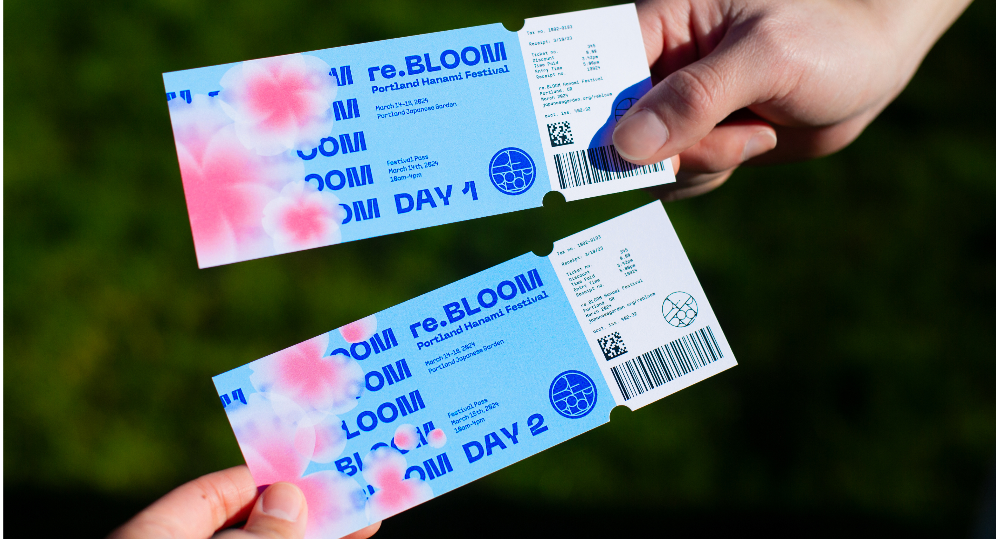
Re.BLOOM is a Hanami [Flower viewing] festival based in Portland, Oregon. Created and designed combining maximalist trends with the natural beauty of cherry blossoms to create a campaign that goes beyond the aesthetics and visual appeal.
Team: Jade Blue, Duncan Bennett
My Roles: Initial Concept, Asset creation, Type, Extensions, Photography & Post Production Editing
Time Line: 4 Weeks
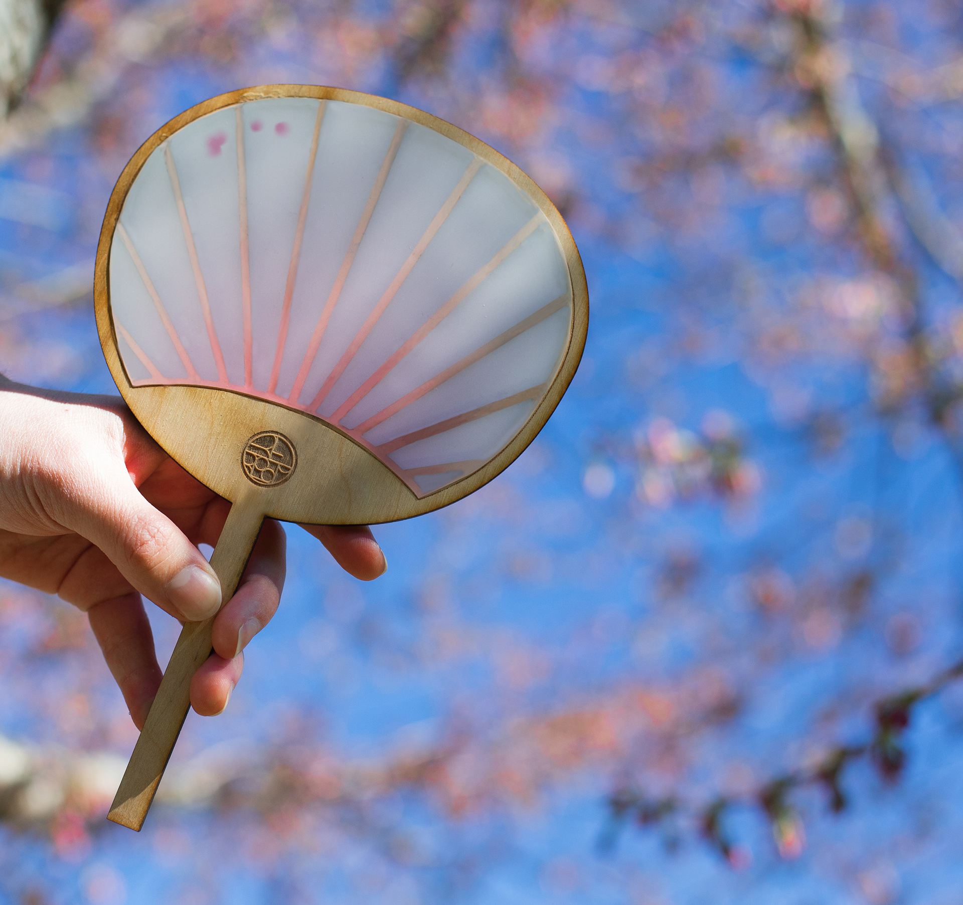
A modern typeface meets a traditional Hanko stamp logo. This is the spirit of our brand - the fusion of new and old runs through everything we do.
Re.Bloom identity mark concept
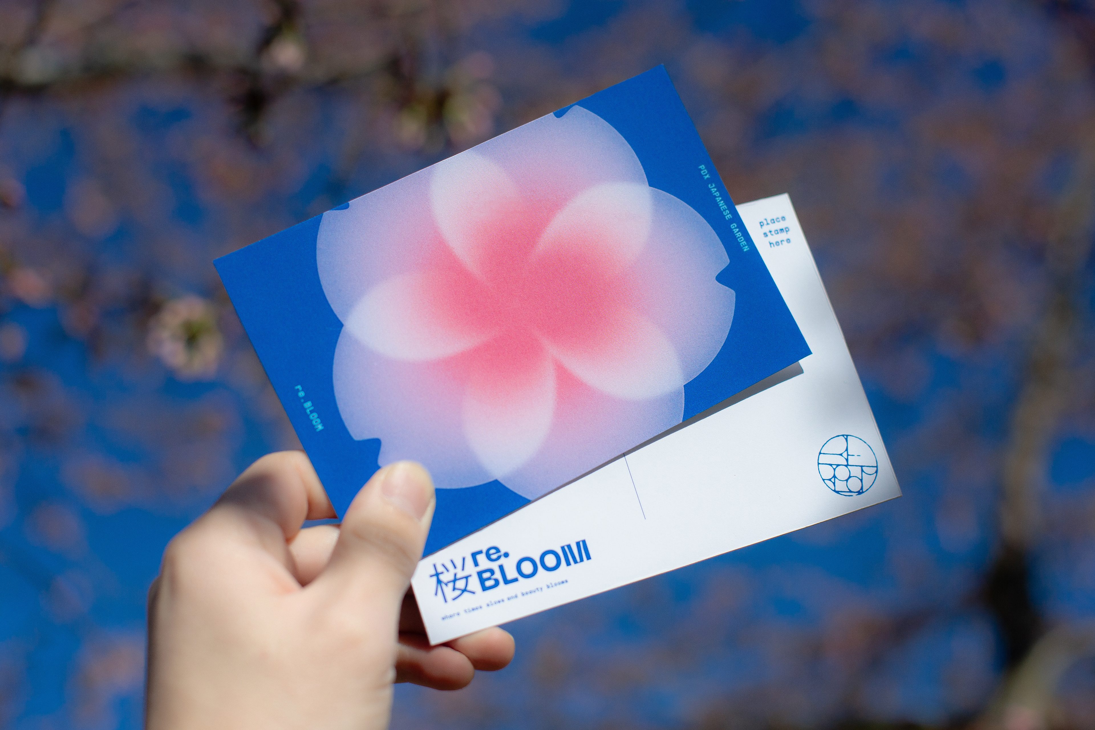
People are ready to embrace new ways of perceiving the world. This appears to be especially true if cultural knowledge can help ease worldly burdens.
Re.Bloom ideology statement
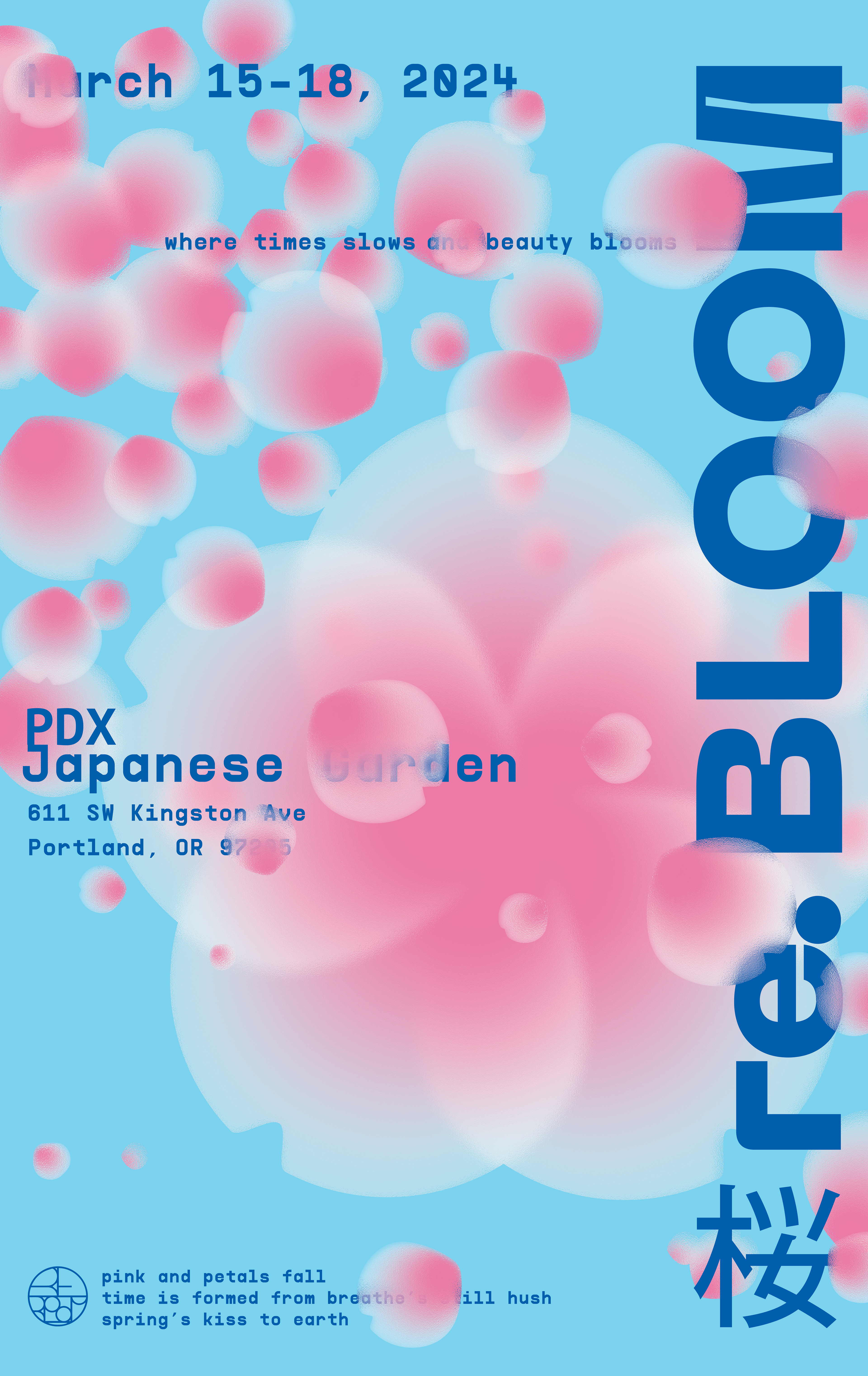
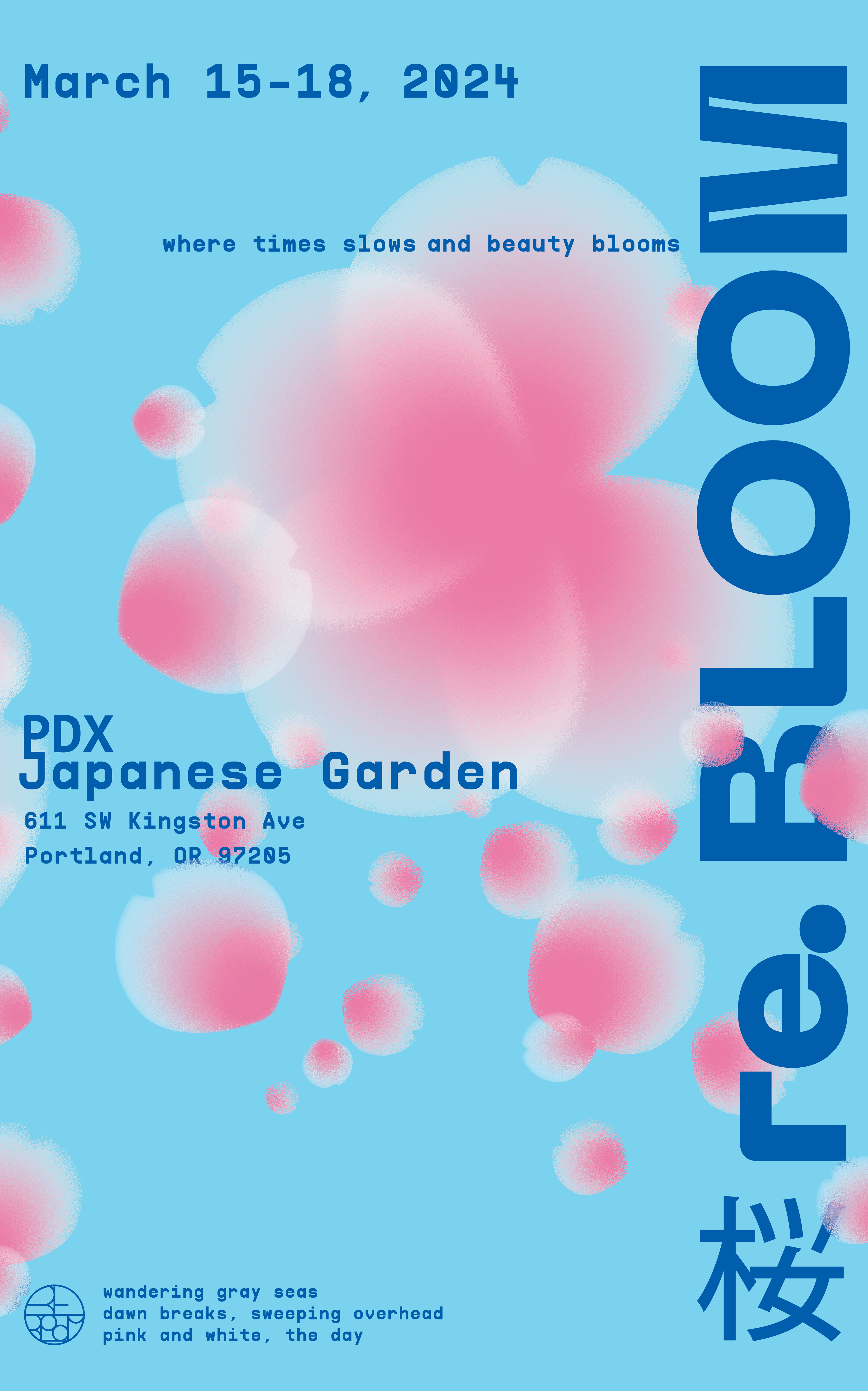
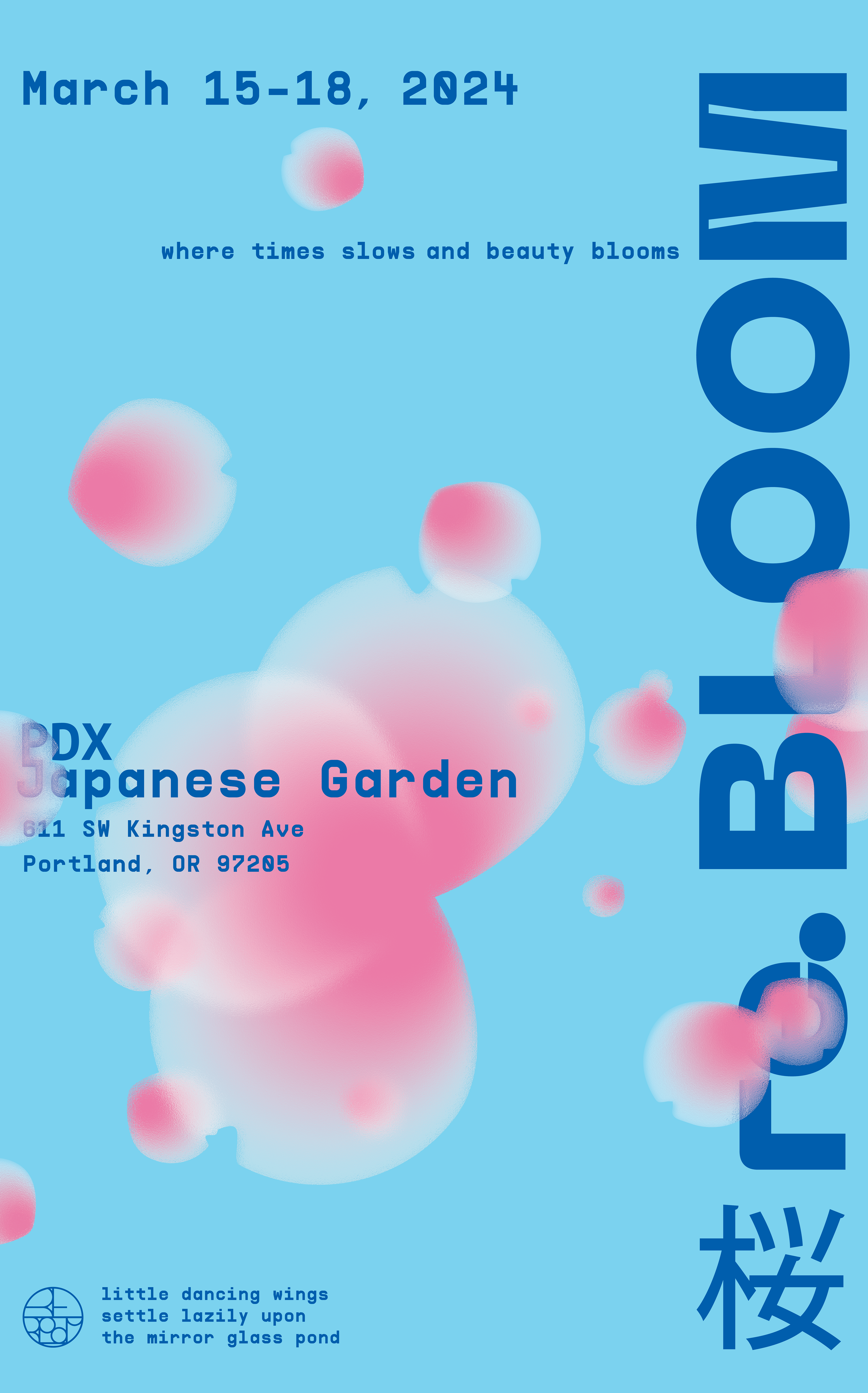
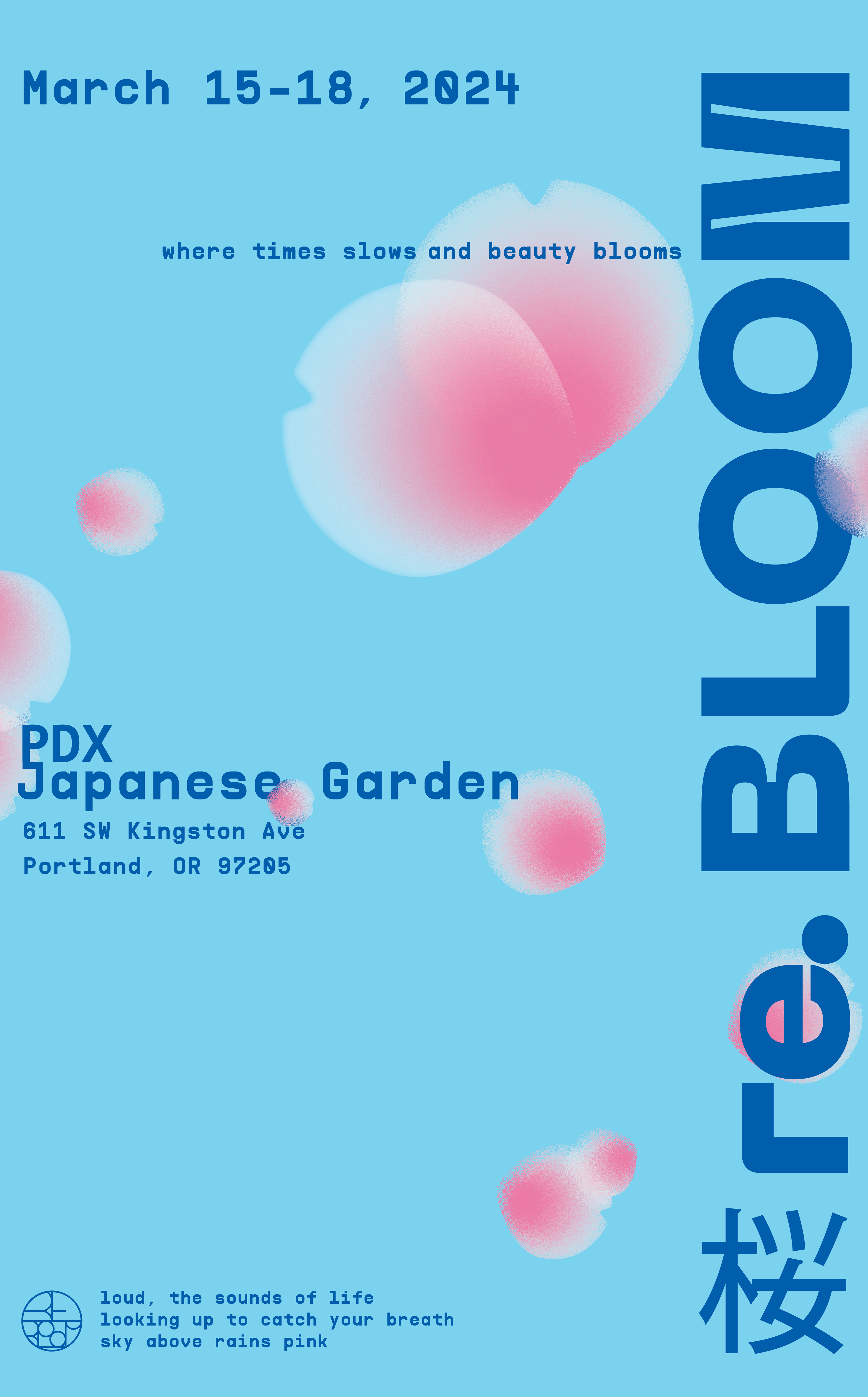
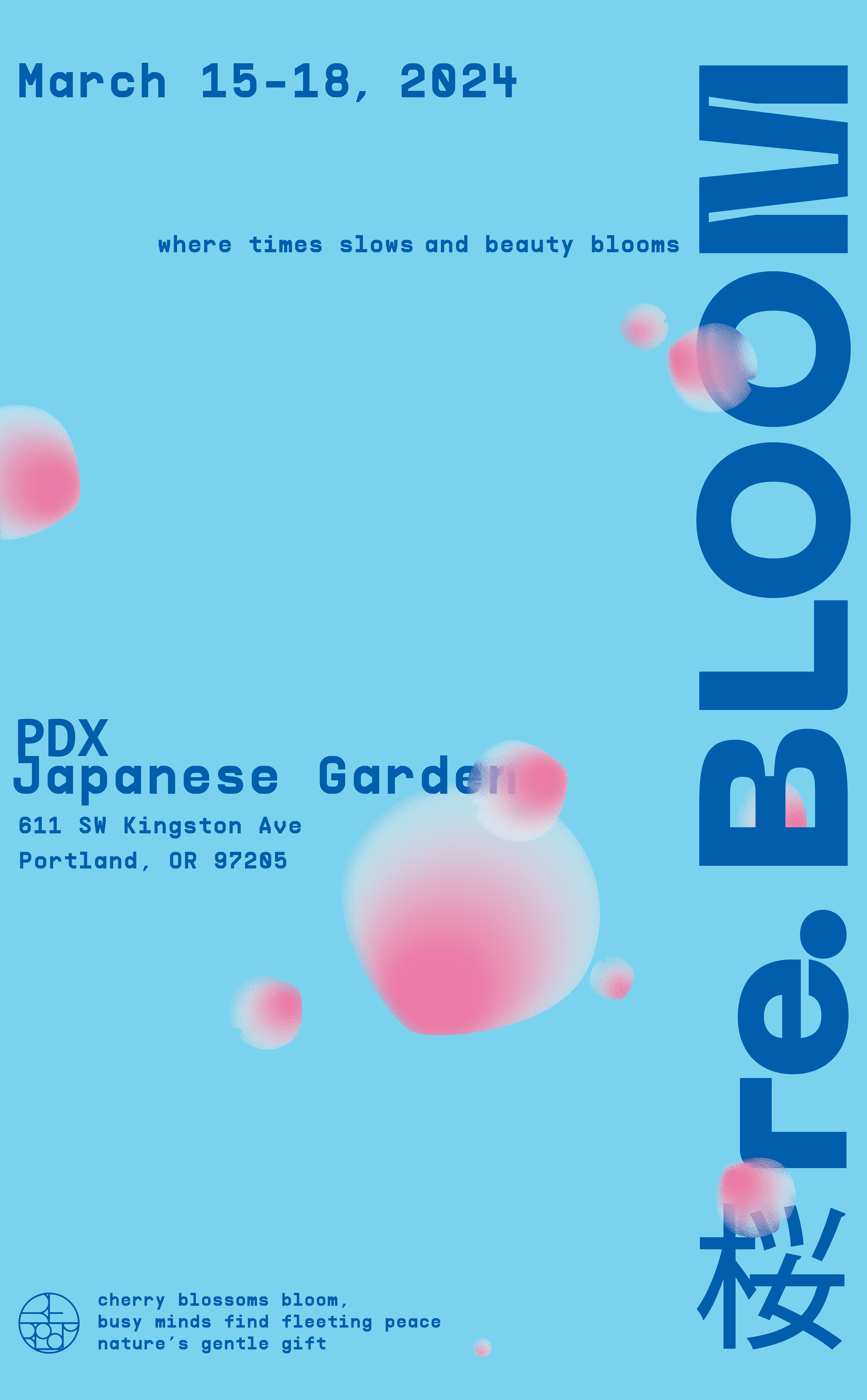
The core message of re.Bloom is expressed through this visual of dissolving blossoms echoing the ephemeral nature of flowers in bloom.
The sentiment: experience the beauty in front of you while it lasts.
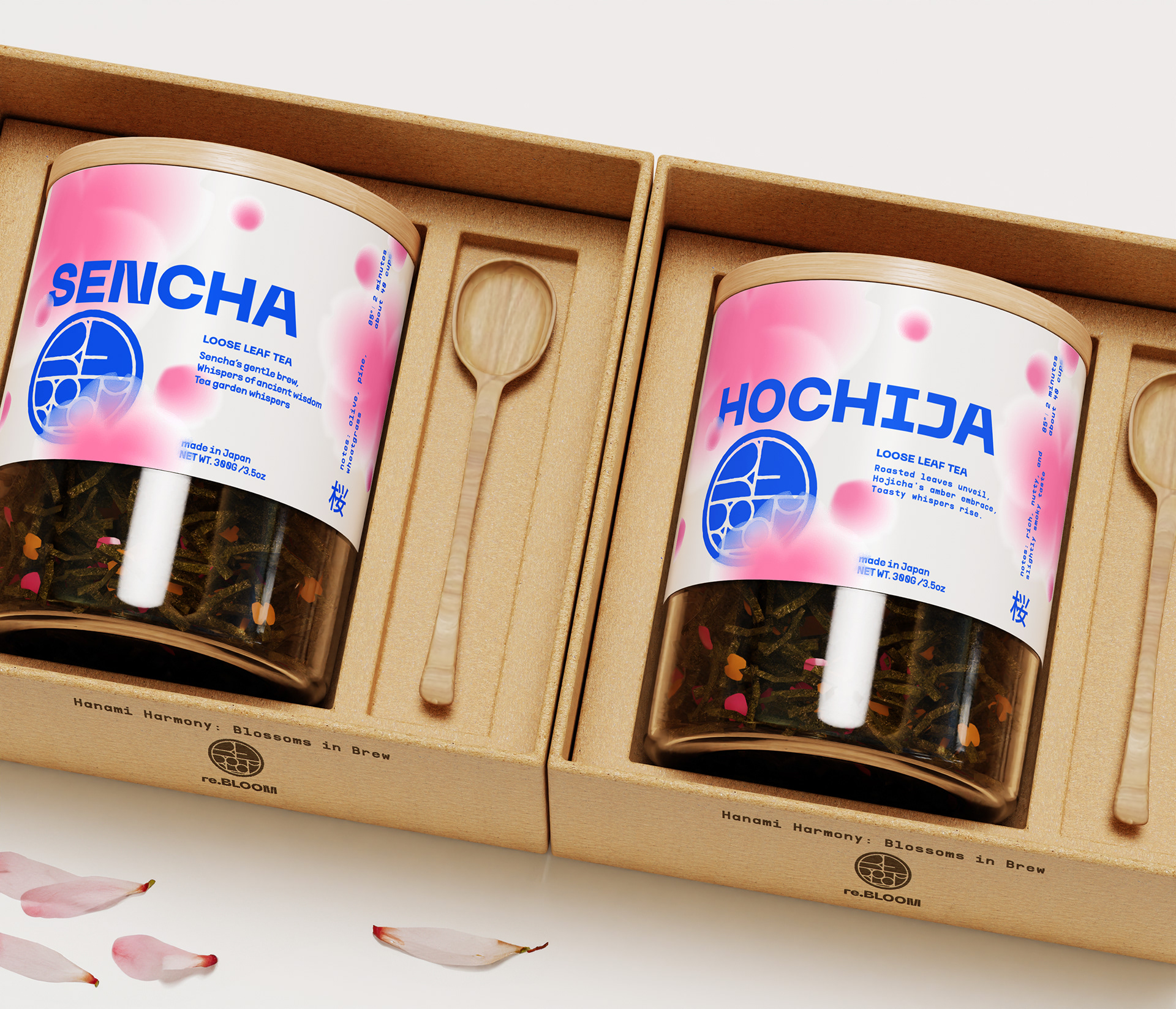
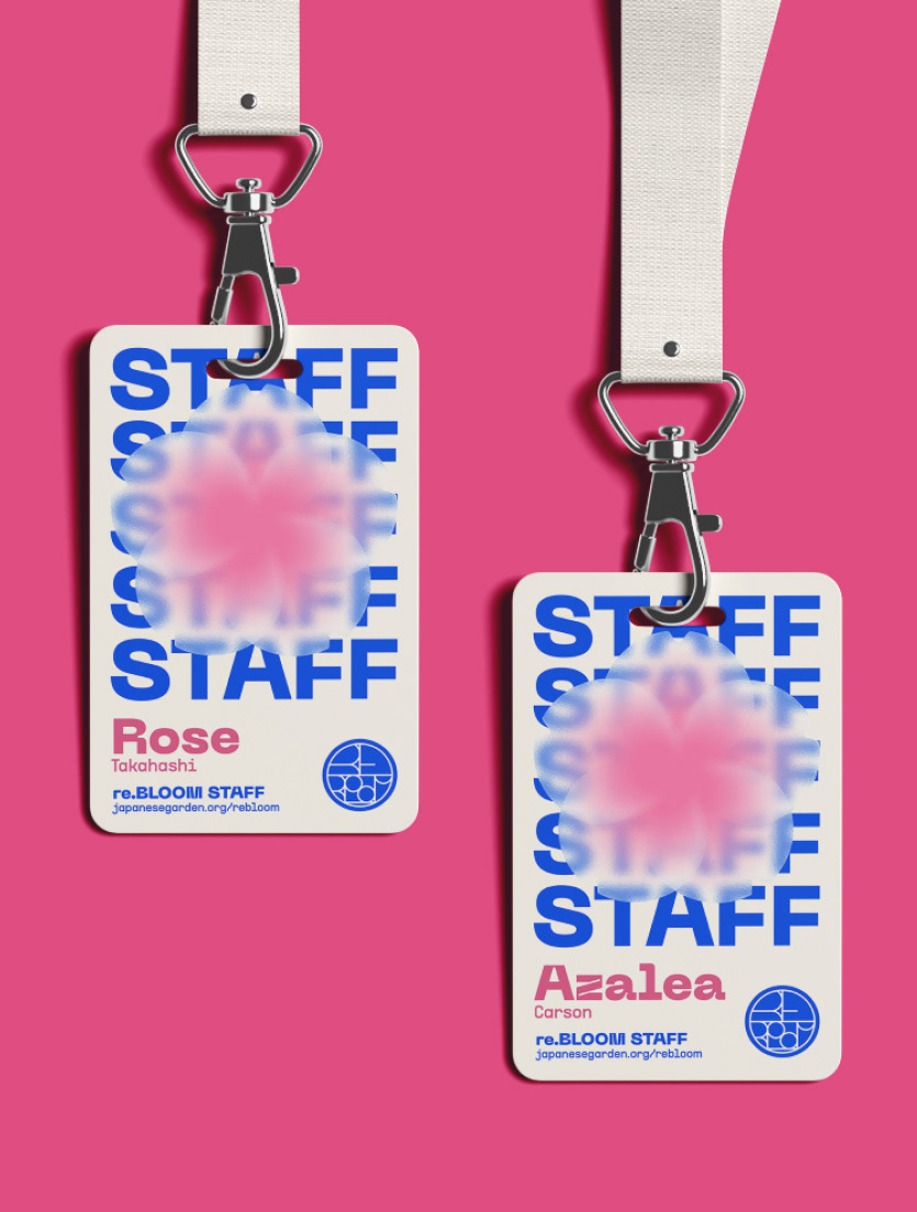
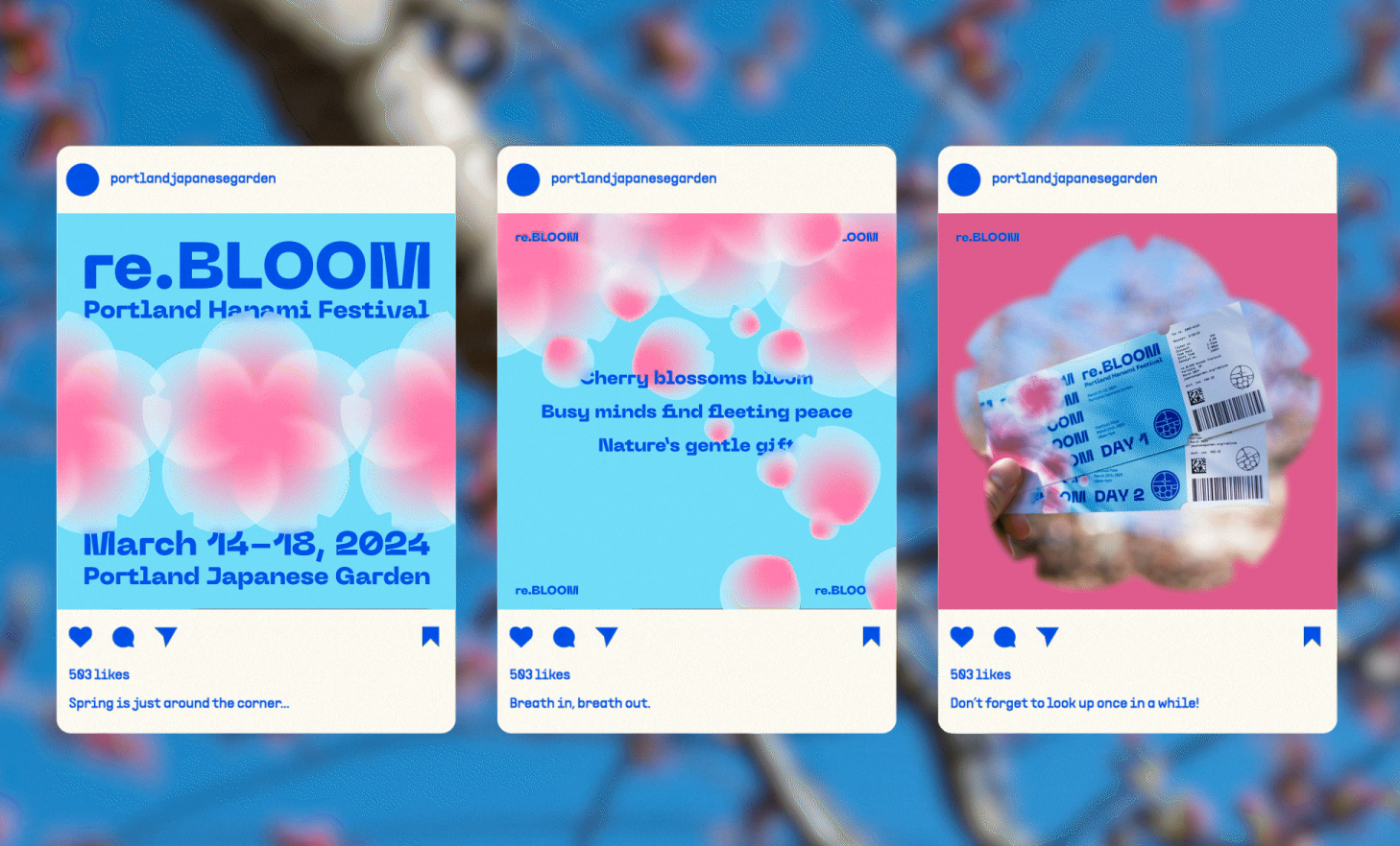
the creation of re.bloom
A comprehensive look into the ideas and concepts behind re.Bloom.
What is Hanami?
Hanami (花見, "flower viewing") is the Japanese traditional custom of enjoying the transient beauty of flowers. It has gained popularity internationally as people all over the states gather at times to witness the fleeting beauty of these blossoms.
Audience
Targeting couples, families, and young people ages 18 to 35, this event hopes to reach the specific individuals within these demographics who feel strained by the pace of urban life. Busy people, tired people, people who need a chance to unwind. In this manner, re.Bloom will pose as a sort of “communal therapy” in which celebration of culture can ease tensions.
Visual: Restrained Maximalism
Maximalism was an option from an earlier point in the process. The bright colors and active space draws viewers in from afar.
Concept Statement:
The modern world is run by a demand for progress that never stops. Nowhere is this plight more relevant than in our nation’s cities. re.Bloom creates a sanctuary of fleeting natural beauty in the heart of Portland, reminding visitors to slow down and observe that, among the chaos, harmony can prevail.
re.Bloom identity mark
A modern typeface meets a traditional Hanko stamp logo. This is the spirit of our brand - the fusion of new and old runs through everything we do.

Color Palette: Spring Has Sprung
A vibrant color palette communicates the feeling of rejuvenation blooming flowers bring. A gradient sweeping from a rich pink to transparent white covers the range of colors displayed by various species of cherry tree.
The use of high contrast pure white and pure black, as well as an electric blue, highlight the intersection between the rapid digital age and the soothing beauty of nature.
The use of high contrast pure white and pure black, as well as an electric blue, highlight the intersection between the rapid digital age and the soothing beauty of nature.
Photography
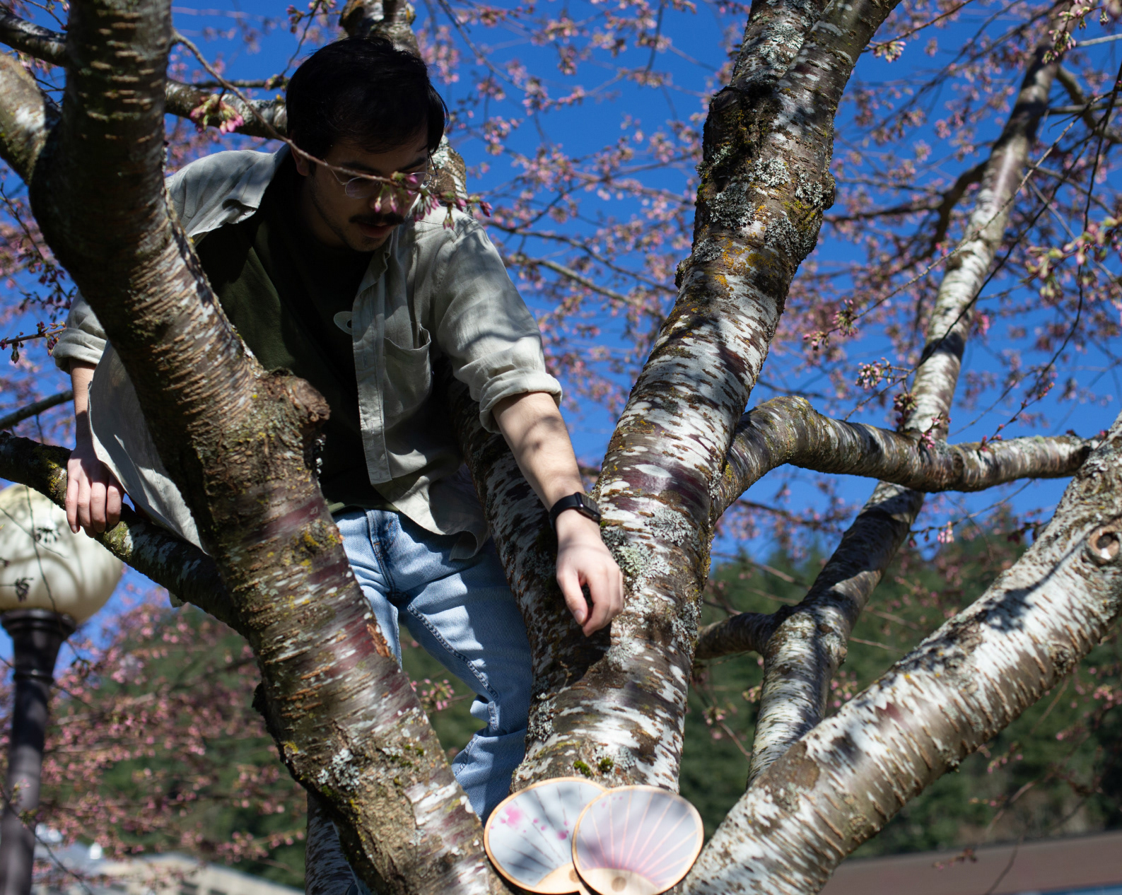
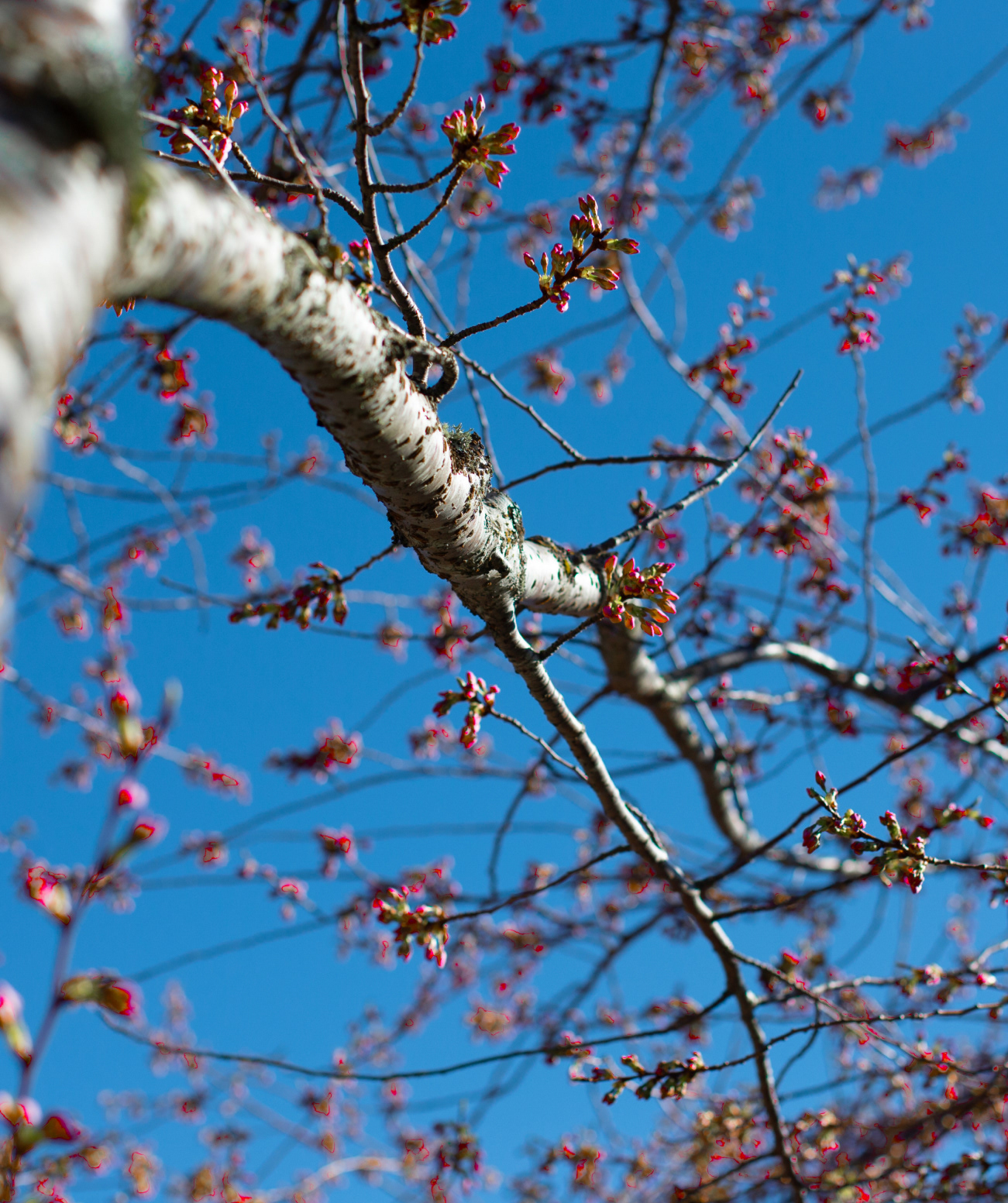
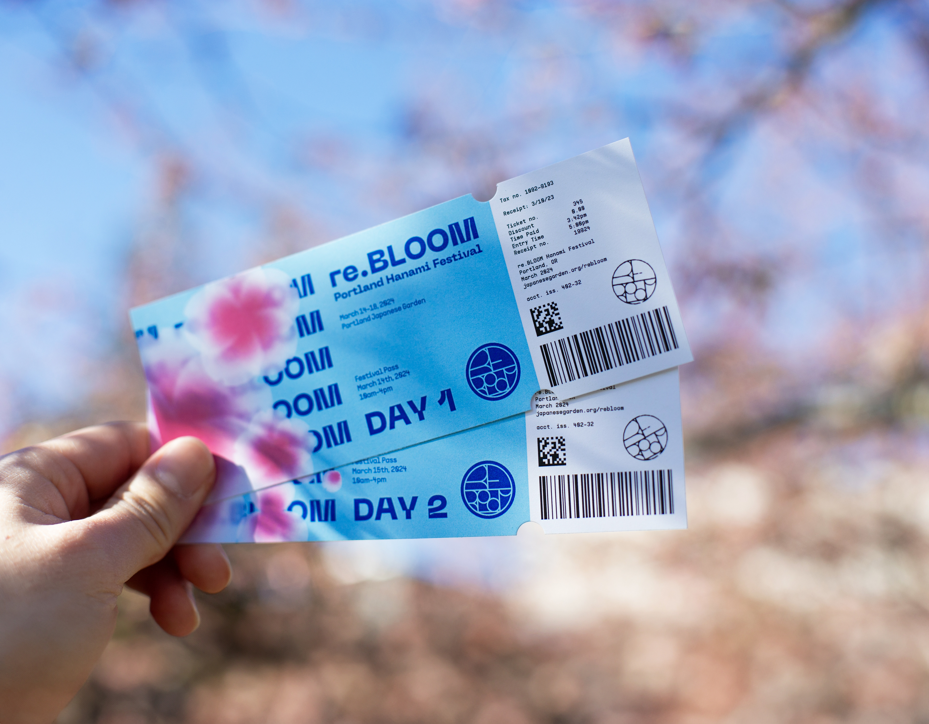
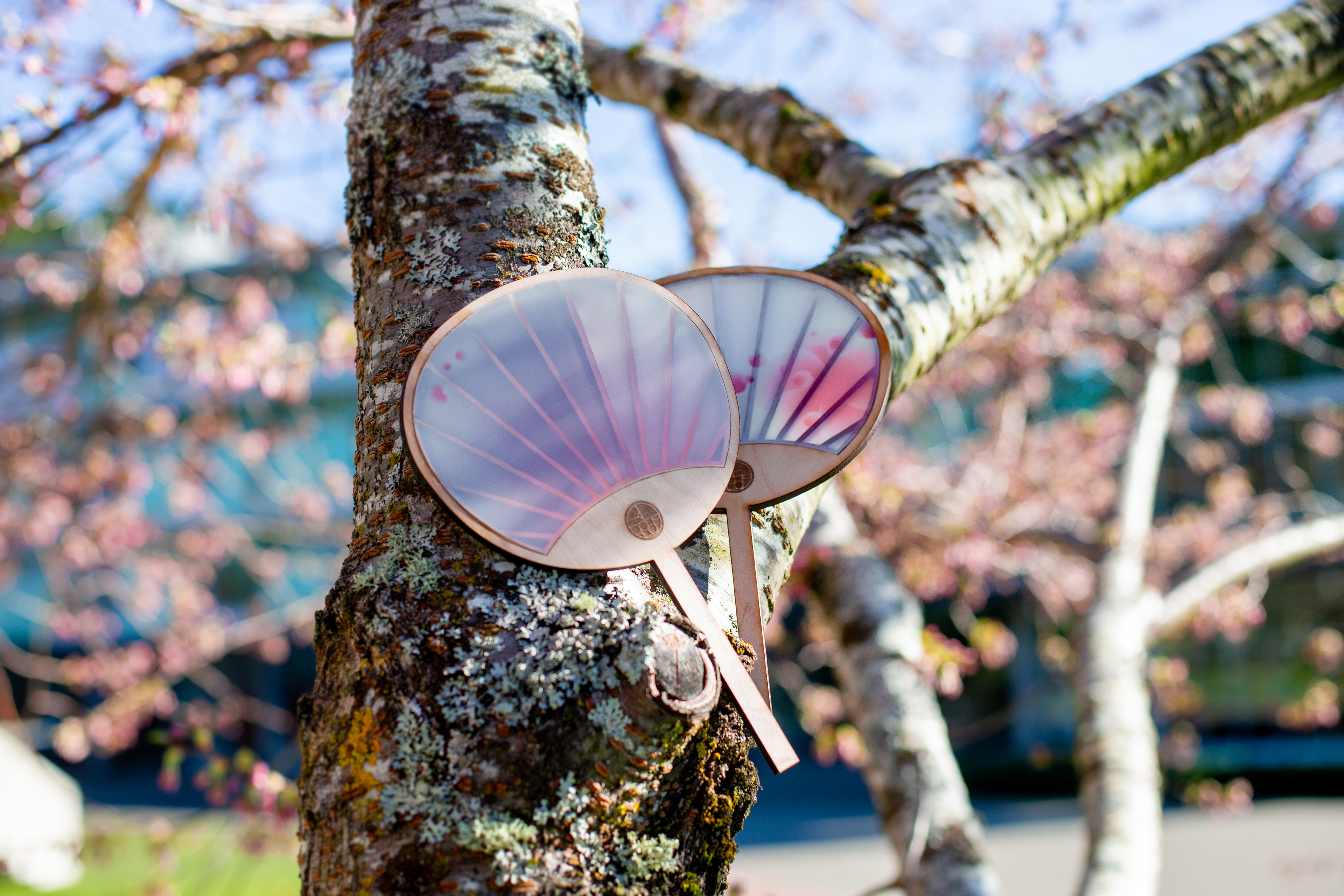
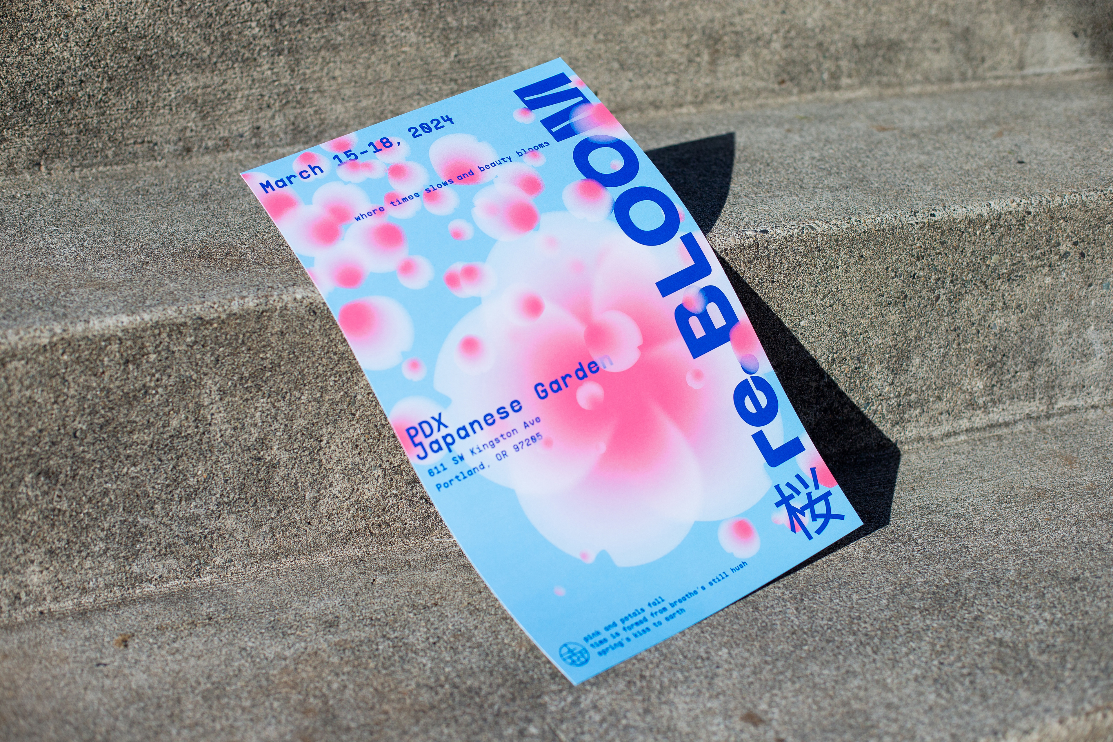
Our objective was to seamlessly blend mockups with real-life photography to enhance the project's presentation.
We aimed to push the boundaries of our photography skills and elevate this project into something more meaningful through a photoshoot. Scaling trees and basking in sunlight, we captured a variety of shots showcasing our products.
A modern twist
A duo of contemporary display fonts speak the event’s message loud and clear.
Header
Subtitle/Body copy


